
- Free for everyone
- 5 charts
- share anywhere
- limited AI use
Graphy for Data Storytelling
0
Graphy enables anyone to become a skilled data storyteller by radically simplifying data presentation and communication. With powerful features and an intuitive interface, Graphy makes it easy to create stunning, interactive graphs that drive decisions and impress your audience.
Graph AI
AI Knowledge Graph
AI Charting
AI SVG Generator
#data visualization
#graph maker
#data storytelling
#AI insights
#collaboration tools
#professional graphs
#customizable templates
#reporting software
#presentation tools
#data-driven decisions
#interactive charts
#user-friendly interface
#team collaboration
#data analysis
#real-time updates
#visual data communication
#insight generation
#easy graphing
#dashboard design
#effective presentations
...
Promote this Tool
Update this Tool

Graphy enables anyone to become a skilled data storyteller by radically simplifying data presentation and communication. With powerful features and an intuitive interface, Graphy makes it easy to create stunning, interactive graphs that drive decisions and impress your audience.
Graph AI
AI Knowledge Graph
AI Charting
AI SVG Generator
#data visualization
#graph maker
#data storytelling
#AI insights
#collaboration tools
#professional graphs
#customizable templates
#reporting software
#presentation tools
#data-driven decisions
#interactive charts
#user-friendly interface
#team collaboration
#data analysis
#real-time updates
#visual data communication
#insight generation
#easy graphing
#dashboard design
#effective presentations
...
Featured
 Video Watermark RemoverAI Video Watermark Remover – Clean Sora 2 & Any Video Watermarks!
- ThumbnailCreator.comAI-powered tool for creating stunning, professional YouTube thumbnails quickly and easily.
- AdsCreator.comGenerate polished, on‑brand ad creatives from any website URL instantly for Meta, Google, and Stories.
- Refly.aiRefly.AI empowers non-technical creators to automate workflows using natural language and a visual canvas.
- BGRemoverEasily remove image backgrounds online with SharkFoto BGRemover.
- Elser AIAll-in-one AI video creation studio that turns any text and images into full videos up to 30 minutes.
- Skywork.aiSkywork AI is an innovative tool to enhance productivity using AI.
- QoderQoder is an agentic coding platform for real software, Free to use the best model in preview.
- FlowithFlowith is a canvas-based agentic workspace which offers free 🍌Nano Banana Pro and other effective models...
- FineVoiceClone, Design, and Create Expressive AI Voices in Seconds, with Perfect Sound Effects and Music.
- VoxDeckNext-gen AI presentation maker,Turn your ideas & docs into attention-grabbing slides with AI.
- FixArt AIFixArt AI offers free, unrestricted AI tools for image and video generation without sign-up.
- SharkFotoSharkFoto is an all-in-one AI-powered platform for creating and editing videos, images, and music efficiently.
- PippitElevate your content creation with Pippit's powerful AI tools!
- Funy AIAI bikini & kiss videos from images or text. Try the AI Clothes Changer & Image Generator!
- KiloClawHosted OpenClaw agent: one-click deploy, 500+ models, secure infrastructure, and automated agent management for teams and developers.
- Yollo AIChat & create with your AI companion. Image to Video, AI Image Generator.
- AI Clothes Changer by SharkFotoAI Clothes Changer by SharkFoto instantly lets you virtually try on outfits with realistic fit, texture, and lighting.
- SuperMaker AI Video GeneratorCreate stunning videos, music, and images effortlessly with SuperMaker.
- AnimeShortsCreate stunning anime shorts effortlessly with cutting-edge AI technology.
- AI Video API: Seedance 2.0 HereUnified AI video API offering top-generation models through one key at lower cost.
- insmelo AI Music GeneratorAI-driven music generator that turns prompts, lyrics, or uploads into polished, royalty-free songs in about a minute.
- WhatsApp AI SalesWABot is a WhatsApp AI sales copilot that delivers real-time scripts, translations, and intent detection.
- BeatMVWeb-based AI platform that turns songs into cinematic music videos and creates music with AI.
- Wan 2.7Professional-grade AI video model with precise motion control and multi-view consistency.
- KirkifyKirkify AI instantly creates viral face swap memes with signature neon-glitch aesthetics for meme creators.
- UNI-1 AIUNI-1 is a unified image generation model combining visual reasoning with high-fidelity image synthesis.
- Text to MusicTurn text or lyrics into full, studio-quality songs with AI-generated vocals, instruments, and multi-track exports.
- Iara ChatIara Chat: An AI-powered productivity and communication assistant.
- kinovi - Seedance 2.0 - Real Man AI VideoFree AI video generator with realistic human output, no watermark, and full commercial use rights.
- Video Sora 2Sora 2 AI turns text or images into short, physics-accurate social and eCommerce videos in minutes.
- Tome AI PPTAI-powered presentation maker that generates, beautifies, and exports professional slide decks in minutes.
- Lyria3 AIAI music generator that creates high-fidelity, fully produced songs from text prompts, lyrics, and styles instantly.
- AtomsAI-driven platform that builds full‑stack apps and websites in minutes using multi‑agent automation, no coding required.
- AI Pet Video GeneratorCreate viral, shareable pet videos from photos using AI-driven templates and instant HD exports for social platforms.
- Paper BananaAI-powered tool to convert academic text into publication-ready methodological diagrams and precise statistical plots instantly.
- Ampere.SHFree managed OpenClaw hosting. Deploy AI agents in 60 seconds with $500 Claude credits.
- Palix AIAll-in-one AI platform for creators to generate images, videos, and music with unified credits.
- HookTideAI-powered LinkedIn growth platform that learns your voice to create content, engage, and analyze performance.
- GenPPT.AIAI-driven PPT maker that creates, beautifies, and exports professional PowerPoint presentations with speaker notes and charts in minutes.
- Hitem3DHitem3D converts a single image into high-resolution, production-ready 3D models using AI.
- Seedance 20 VideoSeedance 2 is a multimodal AI video generator delivering consistent characters, multi-shot storytelling, and native audio at 2K.
- Free AI Video Maker & GeneratorFree AI Video Maker & Generator – Unlimited, No Sign-Up
- Create WhatsApp LinkFree WhatsApp link and QR generator with analytics, branded links, routing, and multi-agent chat features.
- GobiiGobii lets teams create 24/7 autonomous digital workers to automate web research and routine tasks.
- Veemo - AI Video GeneratorVeemo AI is an all-in-one platform that quickly generates high-quality videos and images from text or images.
- ainanobanana2Nano Banana 2 generates pro-quality 4K images in 4–6 seconds with precise text rendering and subject consistency.
- AI FIRSTConversational AI assistant automating research, browser tasks, web scraping, and file management through natural language.
- GLM ImageGLM Image combines hybrid AR and diffusion models to generate high-fidelity AI images with exceptional text rendering.
- AirMusicAirMusic.ai generates high-quality AI music tracks from text prompts with style, mood customization, and stems export.
- WhatsApp Warmup ToolAI-powered WhatsApp warmup tool automates bulk messaging while preventing account bans.
- Manga Translator AIAI Manga Translator instantly translates manga images into multiple languages online.
- TextToHumanFree AI humanizer that instantly rewrites AI text into natural, human-like writing. No signup required.
- Remy - Newsletter SummarizerRemy automates newsletter management by summarizing emails into digestible insights.
- Telegram Group BotTGDesk is an all-in-one Telegram Group Bot to capture leads, boost engagement, and grow communities.
- FalcoCutFalcoCut: web-based AI platform for video translation, avatar videos, voice cloning, face-swap and short video generation.
- SOLM8AI girlfriend you call, and chat with. Real voice conversations with memory. Every moment feels special with her.
Video Watermark Remover
AI Video Watermark Remover – Clean Sora 2 & Any Video Watermarks!
ThumbnailCreator.com
AI-powered tool for creating stunning, professional YouTube thumbnails quickly and easily.
AdsCreator.com
Generate polished, on‑brand ad creatives from any website URL instantly for Meta, Google, and Stories.
Refly.ai
Refly.AI empowers non-technical creators to automate workflows using natural language and a visual canvas.
BGRemover
Easily remove image backgrounds online with SharkFoto BGRemover.
Elser AI
All-in-one AI video creation studio that turns any text and images into full videos up to 30 minutes.
Skywork.ai
Skywork AI is an innovative tool to enhance productivity using AI.
Qoder
Qoder is an agentic coding platform for real software, Free to use the best model in preview.
Flowith
Flowith is a canvas-based agentic workspace which offers free 🍌Nano Banana Pro and other effective models...
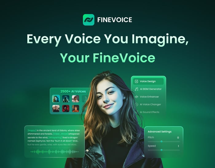
FineVoice
Clone, Design, and Create Expressive AI Voices in Seconds, with Perfect Sound Effects and Music.
VoxDeck
Next-gen AI presentation maker,Turn your ideas & docs into attention-grabbing slides with AI.
FixArt AI
FixArt AI offers free, unrestricted AI tools for image and video generation without sign-up.
SharkFoto
SharkFoto is an all-in-one AI-powered platform for creating and editing videos, images, and music efficiently.
Pippit
Elevate your content creation with Pippit's powerful AI tools!
Funy AI
AI bikini & kiss videos from images or text. Try the AI Clothes Changer & Image Generator!
KiloClaw
Hosted OpenClaw agent: one-click deploy, 500+ models, secure infrastructure, and automated agent management for teams and developers.
Yollo AI
Chat & create with your AI companion. Image to Video, AI Image Generator.
AI Clothes Changer by SharkFoto
AI Clothes Changer by SharkFoto instantly lets you virtually try on outfits with realistic fit, texture, and lighting.
SuperMaker AI Video Generator
Create stunning videos, music, and images effortlessly with SuperMaker.
AnimeShorts
Create stunning anime shorts effortlessly with cutting-edge AI technology.
AI Video API: Seedance 2.0 Here
Unified AI video API offering top-generation models through one key at lower cost.
insmelo AI Music Generator
AI-driven music generator that turns prompts, lyrics, or uploads into polished, royalty-free songs in about a minute.
WhatsApp AI Sales
WABot is a WhatsApp AI sales copilot that delivers real-time scripts, translations, and intent detection.
BeatMV
Web-based AI platform that turns songs into cinematic music videos and creates music with AI.
Wan 2.7
Professional-grade AI video model with precise motion control and multi-view consistency.
Kirkify
Kirkify AI instantly creates viral face swap memes with signature neon-glitch aesthetics for meme creators.
UNI-1 AI
UNI-1 is a unified image generation model combining visual reasoning with high-fidelity image synthesis.
Text to Music
Turn text or lyrics into full, studio-quality songs with AI-generated vocals, instruments, and multi-track exports.
Iara Chat
Iara Chat: An AI-powered productivity and communication assistant.
kinovi - Seedance 2.0 - Real Man AI Video
Free AI video generator with realistic human output, no watermark, and full commercial use rights.
Video Sora 2
Sora 2 AI turns text or images into short, physics-accurate social and eCommerce videos in minutes.
Tome AI PPT
AI-powered presentation maker that generates, beautifies, and exports professional slide decks in minutes.
Lyria3 AI
AI music generator that creates high-fidelity, fully produced songs from text prompts, lyrics, and styles instantly.
Atoms
AI-driven platform that builds full‑stack apps and websites in minutes using multi‑agent automation, no coding required.
AI Pet Video Generator
Create viral, shareable pet videos from photos using AI-driven templates and instant HD exports for social platforms.
Paper Banana
AI-powered tool to convert academic text into publication-ready methodological diagrams and precise statistical plots instantly.
Ampere.SH
Free managed OpenClaw hosting. Deploy AI agents in 60 seconds with $500 Claude credits.
Palix AI
All-in-one AI platform for creators to generate images, videos, and music with unified credits.
HookTide
AI-powered LinkedIn growth platform that learns your voice to create content, engage, and analyze performance.
GenPPT.AI
AI-driven PPT maker that creates, beautifies, and exports professional PowerPoint presentations with speaker notes and charts in minutes.
Hitem3D
Hitem3D converts a single image into high-resolution, production-ready 3D models using AI.
Seedance 20 Video
Seedance 2 is a multimodal AI video generator delivering consistent characters, multi-shot storytelling, and native audio at 2K.
Free AI Video Maker & Generator
Free AI Video Maker & Generator – Unlimited, No Sign-Up
Create WhatsApp Link
Free WhatsApp link and QR generator with analytics, branded links, routing, and multi-agent chat features.
Gobii
Gobii lets teams create 24/7 autonomous digital workers to automate web research and routine tasks.
Veemo - AI Video Generator
Veemo AI is an all-in-one platform that quickly generates high-quality videos and images from text or images.
ainanobanana2
Nano Banana 2 generates pro-quality 4K images in 4–6 seconds with precise text rendering and subject consistency.
AI FIRST
Conversational AI assistant automating research, browser tasks, web scraping, and file management through natural language.
GLM Image
GLM Image combines hybrid AR and diffusion models to generate high-fidelity AI images with exceptional text rendering.
AirMusic
AirMusic.ai generates high-quality AI music tracks from text prompts with style, mood customization, and stems export.
WhatsApp Warmup Tool
AI-powered WhatsApp warmup tool automates bulk messaging while preventing account bans.
Manga Translator AI
AI Manga Translator instantly translates manga images into multiple languages online.
TextToHuman
Free AI humanizer that instantly rewrites AI text into natural, human-like writing. No signup required.
Remy - Newsletter Summarizer
Remy automates newsletter management by summarizing emails into digestible insights.
Telegram Group Bot
TGDesk is an all-in-one Telegram Group Bot to capture leads, boost engagement, and grow communities.
FalcoCut
FalcoCut: web-based AI platform for video translation, avatar videos, voice cloning, face-swap and short video generation.
SOLM8
AI girlfriend you call, and chat with. Real voice conversations with memory. Every moment feels special with her.
What is Graphy for Data Storytelling?
Graphy is a user-friendly platform designed to help individuals and teams create professional-level graphs with ease. The tool simplifies the process of data visualization, allowing users to generate actionable insights from their data. Graphy's intuitive interface and powerful features, such as AI-generated insights, customizable designs, and real-time collaboration, make it an indispensable tool for anyone needing to present data effectively. Whether for presentations, reports, or internal decision-making, Graphy ensures your data is communicated clearly and compellingly.
Who will use Graphy for Data Storytelling?
- Data Analysts
- Business Professionals
- Marketing Teams
- Educators
- Researchers
How to use the Graphy for Data Storytelling?
- Step1: Sign up for Graphy and log in.
- Step2: Upload or paste your data from sources like Google Sheets or Excel.
- Step3: Customize your graph with themes, colors, and annotations.
- Step4: Collaborate with team members in real-time.
- Step5: Export or embed your graph into presentations or reports.
Platform
- web
Graphy for Data Storytelling's Core Features & Benefits
The Core Features
- AI-Generated Insights
- Customizable Designs
- Real-Time Collaboration
- Easy Data Import
- Multiple Chart Types
The Benefits
- Simplifies Data Presentation
- Supports Better Decision-Making
- Improves Team Collaboration
- Enhances Data Storytelling
- Reduces Time Spent on Data Visualization
Graphy for Data Storytelling's Main Use Cases & Applications
- Business Reports
- Marketing Dashboards
- Academic Research
- Sales Presentations
- Internal Data Reviews
Graphy for Data Storytelling's Pros & Cons
The Pros
Simplifies complex data visualization with AI assistance to create charts and explain insights.
Highly intuitive and user-friendly interface requiring no steep learning curve.
Supports collaboration and sharing across popular platforms to align teams and stakeholders.
Faster graph creation reportedly 80% quicker than competitor tools.
Produces beautiful and interactive visuals that enhance data storytelling.
The Cons
No open-source availability limiting customization and community contribution.
No explicit mentions of mobile apps or extensions restricting use to web platform only.
Potential reliance on AI-generated insights could pose limitations if data context is complex.
Graphy for Data Storytelling's Pricing
| Has free plan | YES |
|---|---|
| Free trial details | |
| Pricing model | Freemium |
| Is credit card required | No |
| Paid from | 12 USD |
| Has lifetime plan | No |
| Billing frequency | Monthly |
Details of Pricing Plan
Free
0 USDPlus
12 USD- Everything in Free, plus
- brand colors
- remove watermark
- unlimited charts
- unlimited AI features
Business
- Everything in Plus, plus
- dedicated support
- enhanced privacy controls
Discount:-40%
For the latest prices, please visit: https://graphy.app/pricingFAQs of Graphy for Data Storytelling
Graphy for Data Storytelling Company Information
Analytic of Graphy for Data Storytelling
Visit Over Time
Monthly Visits
154.1k
Avg Visit Duration
00:01:18
Page Per Visit
4.16
Bounce Rate
37.73%
Dec 2025 - Feb 2026 All Traffic
Geography
Top 5 Regions
United States
17.33%
India
9.75%
Russia
3.47%
Brazil
3.09%
United Kingdom
3.04%
Dec 2025 - Feb 2026 Worldwide Desktop Only
Traffic Sources
Search
46.56%
Direct
40.83%
Referrals
8.66%
Social
2.79%
Paid Referrals
0.93%
Mail
0.13%
Dec 2025 - Feb 2026 Desktop Only
Top Keywords
| Keyword | Traffic | Cost Per Click |
|---|---|---|
| graphy | 24.7k | $ 0.92 |
| graph maker | 59.7k | $ 1.58 |
| line chart maker with multiple lines source | 510 | $ -- |
| graphy ai | 440 | $ -- |
| graphy app | 390 | $ -- |
Graphy for Data Storytelling Reviews
5/5
Graphy for Data Storytelling's Main Competitors and alternatives?
- Tableau
- Power BI
- Google Data Studio
- Infogram
- ChartBlocks
You may also like:
AI-powered agent automating tasks across 1000+ apps via natural language, eliminating manual integration steps.
Unified API gateway to 40+ AI models for chat, image and video with smart routing and failover.
LangGraph-Swift enables composing modular AI agent pipelines in Swift with LLMs, memory, tools, and graph-based execution.
GraphSignal is a real-time AI-powered graph vector search engine for semantic search and knowledge graph insights.
Graphlit is an AI agent that generates insightful data visualizations from your data inputs.